Sep 28, 2010

Turtle Soup 2


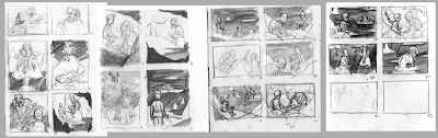
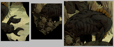
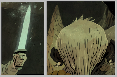
Some more background character work for Turtle Soup.

Since none of the background characters have any importance to the plot (not really, at least) and they exist purely for flavor, doing these sketches is basically just pouring my brain onto the paper. I'm not really thinking about much or looking at much reference (sometimes for uniforms and clothing), but it's more or less stream of conscious.

I am beginning to think that I am the true weirdo here.

Sep 27, 2010

Turtle Soup 1

I am working on a short comic for the second volume of The Anthology Project, along with a lot of really talented people. My story is called Turtle Soup and is about eating too much soup (sort of).

Here are some drawings of some guys that may or may not be in the story. I don't want to give away too much.


The story has two main characters and a lot of people in the periphery. The four-armed bigface you see on pages three, four, and five is one of the main characters, though those are all pretty wrong. I was working on a different story for awhile and that ate up a lot of my time and I drew a few designs (corpses and princes) for that story which were a shame to scrap. I'm trying to incorporate a few of my favorites into the background of this one. This thing will be done by the middle of November, so hold onto your butts because I'm going to try to keep you all updated on it as it goes. It's going to be a lot of fun to draw since I populated it entirely with weirdos and monsters and maniacs.

Here are some panel layouts. There are a few more pages to get tagged onto the end, and then I'm hoping to cull the story down to maybe 10-12 pages total. I have a couple more passes of thumbnails before I get into the real drawings.


I don't draw a lot of comics, but they're pretty fun.

Sep 21, 2010

Salamandurai


A small drawing I did for the dudes over at Drawforce. They do a monthly drawing topic and compile it all into a group blog. The topic for September was samurai. I've been thinking about salamanders recently. What is their deal.

I almost never do one-off character drawings anymore, but that is literally all I did for most of my adolescence. It feels weird to draw a character without an environment or context, but it's also an interesting challenge to try and pack as much narrative as possible into a design. Some different things become prioritized.

I took a character development class with Brian Ralph my junior year of college which really did a lot of good for my work and my sense of humor.

Sep 20, 2010

GIVEAWAY WINNERS!

Wow, amazing response, thanks everyone! I really appreciate all the nice comments and all the RTs on twitter as well. The winners, via random number generator are as follows:

1. Chris Colella!
2. Hannah Lee Stockdale!
3. Guy!
4. Mark Grambau!
5. David Huyck!
6. Katie Rose!
7. Pedro Paulo!

If your name is on that list, send me an email with your address and I'll get your print out as soon as possible! If you have a preference for what you get, let me know, but no guarantees, sorry. If you don't send me your info by Friday I'll choose another winner instead, so be quick about it. I'm going to try to send all of this stuff out next week.

A clarification: I WILL be making these prints, among others, available for sale sometime in the future, so if you didn't win one, you can still buy one from me. Just not until I can afford a large-format printer. I will even make it a contest. You can send me money and I will do use a random number generator (min: 1 max: 1) and then you will also be a winner.

Thanks again for the great turnout, and I hope some of you stick around for the next 200 posts.

Sep 13, 2010

GIVEAWAY

Hey everybody,

I just wanted to say thanks to everyone who's followed my work here and on Picturebook Report. I just passed two hundred posts here, and to commemorate that I'm giving a few prints away:
This is the first time I've offered prints online and the first time these Hobbit prints have been available at all. This is also, I believe, the last time I will offer any prints until I buy a large-format printer (probably some time next year). All of the Hobbit prints are around 11x17", and the Transferring Risk prints are just tiny little guys.

All you've got to do to enter to win one of these is comment on this post. Anything you want. Liking this post on Google Reader nets you another chance to win, so there's an incentive to follow the blog! Tell your friends! I'll pick a few winners randomly in a week or so.

In other news, I am waist deep in Hobbit 6, and I hope to get it done sometime this week. I have been waylaid by unforeseen (and boring) work.

SPX was a great time, and everybody I met there was super great. So, if I met you there, you are super great. I hope to have a table next year.

Here is a bunch of the stuff Kali and I came home with:

edit: Since a lot of people asked, the Spider-Man print is by Joseph Lambert, who had a lot of amazing work at the show (Joe, we only met briefly! You talked mostly to my girlfriend Kali). The Captain America and Crossroads (blue) prints are from Michael Cho. We were only going to get one but couldn't decide and he was gracious enough to offer us a deal! I also bought a Cat Rackham print from Steve Wolfhard (top), who is hilarious. I picked up minicomics from a ton of awesome people, but the books Kali and I bought were Prison Pit #2 by Johnny Ryan, Indoor Voice by Jillian Tamaki, and The Venice Chronicles by Enrico Casarosa. They are, all of them, terrific.

Thanks for all the comments! The response is truly overwhelming. Contest is open until next week, so keep them coming!

Sep 6, 2010

Baryonyx

A small birthday gift for my little cousin, who likes dinosaurs. I also like dinosaurs.

This is Baryonyx. He eats fish and has giant thumbclaws. He's sort of like a doofy crocodile.

The end.

Sep 3, 2010

The Pitmen Painters

In the middle of that Naga Fireball job, I got a call from Jordan Awan at the New Yorker asking if I could turn something around really quickly for their upcoming issue. The assignment came in on Saturday afternoon with a Monday morning deadline, which was exactly when that Naga Fireball stuff was due! The time was cramped, but when I saw what the piece was about it was impossible to turn down.

The Pitmen Painters is an upcoming play focused on the true story of a group of miners who hire a professor to teach them Art Appreciation classes, and eventually painting classes.

Some sketches. The middle sketch was sort of a joke, but it's obvious what part of the art school life a regular blue-collar worker would appreciate the most.
The issue comes out this week.

Sep 2, 2010

Misc


A few miscellaneous pages from the sketchbook that I thought were kind of fun. The top are some sketches from the Naga Fireball assignment and the bottom are some severed heads surrounded by a few regular heads.

Sep 1, 2010

Eagles 2


Eagles are super hard to draw. I really like stretching them out and making them almost serpentine. Still have a lot of structural stuff to learn and there are a lot of crazy shapes under all those feathers.

Aug 30, 2010

Naga Fireballs

Sorry for the slight lapse in posting, everyone. The majority of the last week was spent holed up in my apartment frantically cracking away at a couple of things. This is one of them, a two-page spread and spot for Muse Magazine, with art directed by the World Famous John Sandford.

The story these accompany is about the Naga Fireballs, a natural (probably) phenomenon that occurs in the Mekong river in Thailand's Nong Khai province. Dozens of witnesses annually report these pinkish lights that rise up off the waters surface and hover, stationary, before ascending into the sky. Thousands of these lights are reported each year.

Experts credit the lights to pockets of methane gas trapped in the riverbed which are released and ignite when exposed to oxygen. Some superstitious locals credit them to the Naga, a god-serpent that makes its home in the Mekong river. The lights are also called "ghost fireballs."

Fun fact: the Wat Pa Luang temple is a regular hotspot for these lights. The temple is also famous for its monks who keep bengal tigers.

A couple of details:


An accompanying spot, depicting the shadow of the Naga:
The final spread, with the title text that I also drew, as well as the article.
I did a textured background for the third page of the article, which is overlaid with the spot:
After reading the article, a few obvious things flew to the surface immediately: Buddhist monks, clad in their saffron and red robes, the pink lights, the mysterious Naga. I wanted to downplay both the scientific and mythological explanation for the fireballs and focus solely on the phenomenon. I knew I could hint further at the folklore in the spot, but I wanted to keep the spread relatively grounded in reality. Trawling the internet for reference images yielded photo after photo of the local fishermen who work on the Mekong every day.

Among the few liberties I took with the source material, the biggest was that the article specifically states that the lights occur at night. John mentioned that he'd rather have a light background with darker text overlaid and I was totally for it. Hovering lights at night always evokes aliens to me, and lights in the mist says will-o-wisps, which is closer. Having lights occurring in the daytime also clarifies that these aren't being shined from a source but are themselves the source.

Aug 18, 2010

Voldemorts

Kali and I were listening to the Harry Potter audiobooks a few weeks ago while we were working. They're pretty good to work to. Don't really care for the films much, I have to say. They made a lot of bad decisions during the production phase of all those movies. Pretty fun books, though.

I thought it would be pretty cool if Voldemort had flaky skin like snakes get when they're about to shed. Remember when he was that little talking fetus? And then later he was that gross, raw fetus guy under the bench in heaven? That was some weird stuff.

The "Half Way" on the bottom was a little note to myself that these pages mean I officially passed the half-way point of this sketchbook. I started this one in June, so I feel pretty good that I'm cruising through. This is a really terrific sketchbook that Mel Chao and Mark Grambau of To Boldly Fold sent me, and if anyone's looking for an amazing looking sketchbook filled with Rives BFK, go to Mel's store and pick one up.

Aug 11, 2010

Dead guys again

There are some dead guys in the story I'm currently working on, but these are more prospective, since the next story has a principal character who is a corpse. I feel like it's necessary for anyone interested in drawing fantasy or horror to know how to draw a good corpse, since it's surprising how often they pop up in stories.

Dead or decayed bodies are an interesting challenge as an artist. When you're drawing living figures, you can really play with shapes since flesh, muscle, and fat vary so much person to person. However, when you break that down and you're relying more on the skeleton and less on the soft tissue, the focus has to change. Unless you're the Elephant Man, your skeleton and skull probably looks just about the same as anybody else. Gesture gives way to texture and the form naturally takes on more angularity. Once the structure of the skull or skeleton is established you can start adding on uneven layers of the remaining flesh. It's all very gruesome and interesting to think about.

This applies also to zombies and the undead in general.

A fun fact about corpses is that the hair and nails continue to grow for a few days after death.

These guys work in a quarry, or they used to, I guess. They mostly just lie around rotting these days.

Next time I'll draw some baby deer or whatever.

Aug 10, 2010

Princes


The prince isn't a major character, but he exists and so I had to draw him. When I hit the middle drawing I knew I wanted him to be a general or an admiral-- some sort of war hero and then I got distracted drawing medals and here we are.

Reed told me to draw a corpse prince and so there he is.

Aug 9, 2010

Eagles 1


The eagles, like the wolves (wargs) in The Hobbit have always seemed weird to me. I don't know why, but even as a kid I wasn't really ready to believe that these were talking animals. For whatever reason, despite the elves and trolls and dragons, the things that kept sticking out to me were that the birds and dogs talked. It was weird.

By all accounts and purposes these are just regular eagles (and wolves), but bigger and they talk. Seems a little weird. I guess it just seemed really cartoonish, in a bad way. Like I was watching Winnie the Pooh with that talking owl.

I'm hoping to inject a little humanity into this design without anthropomorphizing it and without making it seem like a Disney movie. I originally planned on doing something like the bird people in Zelda, and that may still happen at some point in the design phase.

At this point, however, I'm just getting used to drawing birds. They are some weird things.

Aug 6, 2010

More dead guys

Getting better...

My work already has a pretty heavy Mignola influence, that's pretty easy to see. I'm a huge fan of his work and besides that we have a lot of the same influences (Frazetta, Wyeth, etc. Shape-based illustrators and painters), so when I'm drawing things that dip into his familiar territory (i.e. SKULLS), it's hard not to draw the parallel. It just means that I need to tap into some other vein. These are starting to drift in a good direction, though I'm sure I'll never be rid of that looming shadow. I'm not sure I'd want to be.

Aug 5, 2010

Dead guys


These corpses are part of a new project I'm working on. They are unfortunately a very small part, but you can never be too practiced at CORPSE DRAWING.

Also, a new project after this other new project has a lot of corpses to draw, so you know, always be prepared.

Aug 3, 2010

Some more pokemon


I must apologize for the recent lapse in posting. I've been working on some things that don't have pictures yet. I'll continue to try and show some nonsense until I can post some more substance.

I guess I remember some Pokemon better than others. I was on a Poison-type kick today.

Jul 26, 2010

Transferring Risk

This is a small drawing I did for this month's issue of Plansponsor Europe (you can read the magazine on line here), art directed by Soojin Buzelli. The article was about transferring risk.

Plansponsor is chock full of world-class illustrators putting out amazing work every month, and it's a publication I've wanted to work for since I first started a client list. Soojin is really open to different styles and different interpretations of the rather dry material, which always leads to interesting illustration. A lot of my favorite work from my favorite illustrators can be traced back to Soojin.

This is also the second time you can find my illustration in a magazine and then flip a few pages to find one by Jillian Tamaki, so that's awesome. The first was last December's New Yorker.

Some thumbnail sketches:


The best three sketches:

A mockup after the sketch was chosen.

Jul 21, 2010

The Hobbit, part five: process

It seems strange to say that this was the most difficult installment so far, since I feel that way about every piece. This one was, though. Let's get right to it.A few pages of thumbnails down and I had nothing. Like, nothing nothing. Usually I figure out about what I want before too long after I start thumbnailing and that thread leads me to the final image fairly easily. Not the case! This one required more.
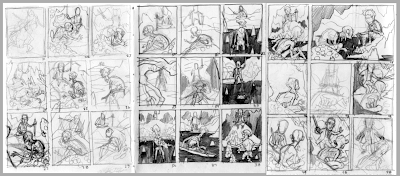
The second set of thumbnails went a lot better than the first, owing probably to the week or two I took off before approaching the image again. I was still really struggling trying to figure out what I needed to show and what I wanted to show. This chapter is about Bilbo and Gollum engaged in conversation with each other. It is about Bilbo being on his own and finding the unknown at the heart of the mountain. I still wanted to show Gollum, because he is interesting. However! Bilbo is more important than Gollum, and I began to realize where the focus needed to rest. The last few thumbnails on the last page are on to something.
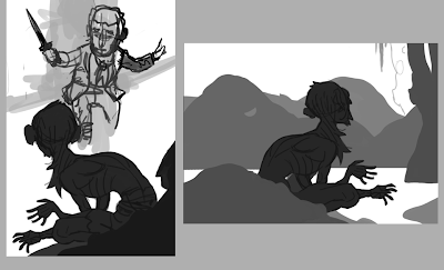
I figured out a pose for Gollum that I was pretty happy with, and began trying to build the scene around him, starting with Bilbo. I like doing this digitally because I don't get caught up in the details as easily and can, of course, move things about with total freedom. This didn't work out really well, because I went about it in a stupid way. I went back to my heroes of composition (largely Golden Age illustrators [largely N.C. Wyeth]) and found a particular raised horizon line that I liked. I wanted to incorporate something like that into the image and went back to pencil and paper.
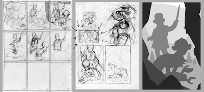
All right, here we are. After a few more hiccups, I had something that was pretty close to accurate there on the middle page. I took that into the computer and started blocking in the shapes, moving things and resizing them as necessary until I had the image on the right.
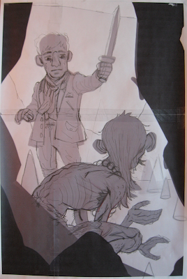
As with the previous Hobbit piece, I printed out the enlarged digital thumbnail and started drawing right on it. This is printed on four pages of copy-paper, comped together at full size (about 11.25x16.5"). The drawing of Bilbo is unbelievably hilarious to me. Terrible terrible terrible. Anyway!
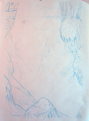
I gathered some reference of caves and such and sketched out some rocks for the background. I was pretty sure most of those along the edges would be blacked out, but you never know, so I drew them all in anyway.
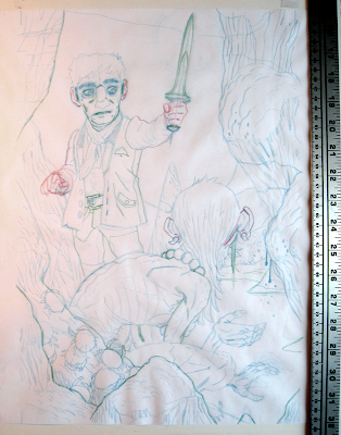
I'm using a few different Col-Erase pencils here, which I really like. It's nice to be able to work in layers on a single drawing. The sword I drew in Bilbo's hand is really terribly angled, and I wouldn't realize that until after I drew it on the final, and changed it immediately before scanning.
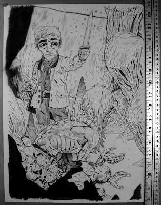
Yeah! Final drawing! I blacked out a few of the rocks in this that I knew were only going to be shown in silhouette. I had a pretty good time drawing Gollum's weird little body.
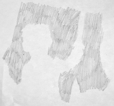
This is a little extra pencil texture to go in the background.
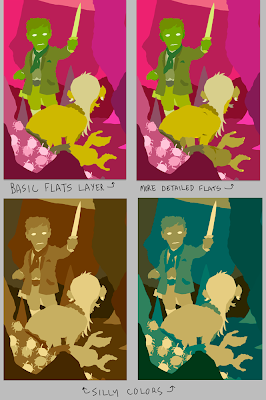
The flatting process. The basic flats layer is helpful for when I'm blocking in colors, and the more detailed layer is for making selections. I was playing around with a few different adjustment layers and cam across those two color examples on the bottom, which I thought were pretty neat. Neither would work for the final, obviously, but I liked them nonetheless.
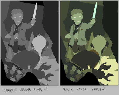
I did a quick pass to figure out my values before going into the real colors. This was really helpful, and I feel pretty dumb for not doing it before now. Oh well. Kali suggested that, and I did it because she's a genius. She also helped me out with a lot of the colors. The basic colors I went with are there on the right. The colors always get slightly changed and acquire more depth once I start to add texture and what little traditional rendering I do.
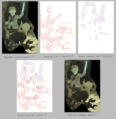
I've explained a few times what goes on in these few steps, so I won't harp on it too much. I select my flats and apply textures on a single layer above my color layer. My textures are mostly from high resolution watercolor brushes and some other custom stuff. The purple and red layers are drawn in where I think shadows should fall and are set to Multiply.
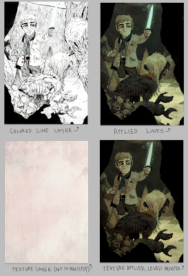
Colors are applied to some of the lines and a few more overall textures are added. The texture layer helps to make the colors a little more cohesive. The levels get adjusted and there we go!

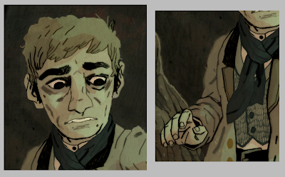
Some details:

And a larger version of the final image for your perusal.
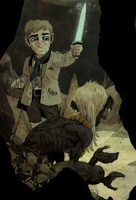
Thanks for reading and for following this project through its trials and tribulations. This is a difficult process, and I really appreciate the encouragement. I hope these posts are helpful.