It seems strange to say that this was the most difficult installment so far, since I feel that way about every piece. This one was, though. Let's get right to it.
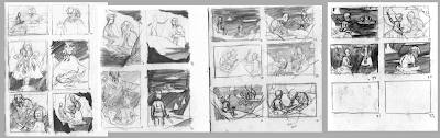
A few pages of thumbnails down and I had nothing. Like, nothing nothing. Usually I figure out about what I want before too long after I start thumbnailing and that thread leads me to the final image fairly easily. Not the case! This one required more.
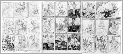
The second set of thumbnails went a lot better than the first, owing probably to the week or two I took off before approaching the image again. I was still really struggling trying to figure out what I needed to show and what I wanted to show. This chapter is about Bilbo and Gollum engaged in conversation with each other. It is about Bilbo being on his own and finding the unknown at the heart of the mountain. I still wanted to show Gollum, because he is interesting. However! Bilbo is more important than Gollum, and I began to realize where the focus needed to rest. The last few thumbnails on the last page are on to something.
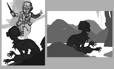
I figured out a pose for Gollum that I was pretty happy with, and began trying to build the scene around him, starting with Bilbo. I like doing this digitally because I don't get caught up in the details as easily and can, of course, move things about with total freedom. This didn't work out really well, because I went about it in a stupid way. I went back to my heroes of composition (largely Golden Age illustrators [largely N.C. Wyeth]) and found a particular raised horizon line that I liked. I wanted to incorporate something like that into the image and went back to pencil and paper.
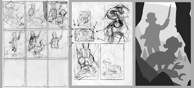
All right, here we are. After a few more hiccups, I had something that was pretty close to accurate there on the middle page. I took that into the computer and started blocking in the shapes, moving things and resizing them as necessary until I had the image on the right.
As with the previous Hobbit piece, I printed out the enlarged digital thumbnail and started drawing right on it. This is printed on four pages of copy-paper, comped together at full size (about 11.25x16.5"). The drawing of Bilbo is unbelievably hilarious to me. Terrible terrible terrible. Anyway!
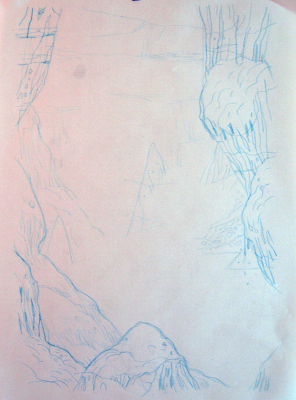
I gathered some reference of caves and such and sketched out some rocks for the background. I was pretty sure most of those along the edges would be blacked out, but you never know, so I drew them all in anyway.
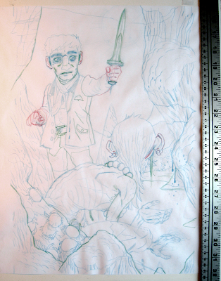
I'm using a few different Col-Erase pencils here, which I really like. It's nice to be able to work in layers on a single drawing. The sword I drew in Bilbo's hand is really terribly angled, and I wouldn't realize that until after I drew it on the final, and changed it immediately before scanning.
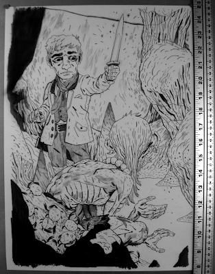
Yeah! Final drawing! I blacked out a few of the rocks in this that I
knew were only going to be shown in silhouette. I had a pretty good time drawing Gollum's weird little body.
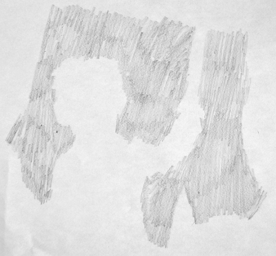
This is a little extra pencil texture to go in the background.
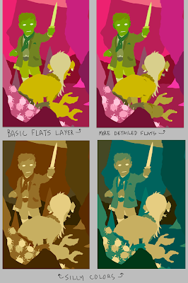
The flatting process. The basic flats layer is helpful for when I'm blocking in colors, and the more detailed layer is for making selections. I was playing around with a few different adjustment layers and cam across those two color examples on the bottom, which I thought were pretty neat. Neither would work for the final, obviously, but I liked them nonetheless.

I did a quick pass to figure out my values before going into the real colors. This was really helpful, and I feel pretty dumb for not doing it before now. Oh well.
Kali suggested that, and I did it because she's a genius. She also helped me out with a lot of the colors. The basic colors I went with are there on the right. The colors always get slightly changed and acquire more depth once I start to add texture and what little traditional rendering I do.
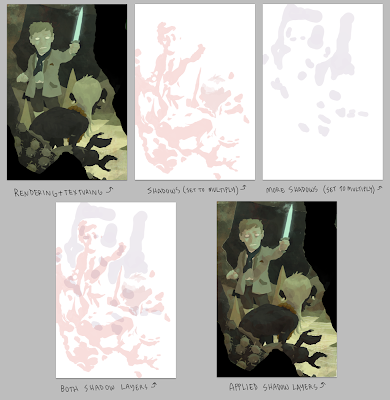
I've explained a few times what goes on in these few steps, so I won't harp on it too much. I select my flats and apply textures on a single layer above my color layer. My textures are mostly from high resolution watercolor brushes and some other custom stuff. The purple and red layers are drawn in where I think shadows should fall and are set to Multiply.
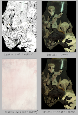
Colors are applied to some of the lines and a few more overall textures are added. The texture layer helps to make the colors a little more cohesive. The levels get adjusted and there we go!
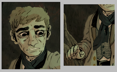
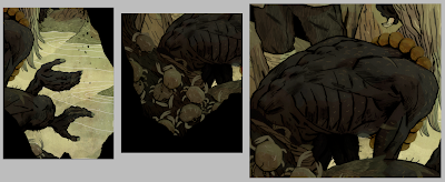
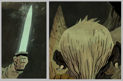
Some details:
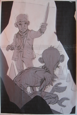
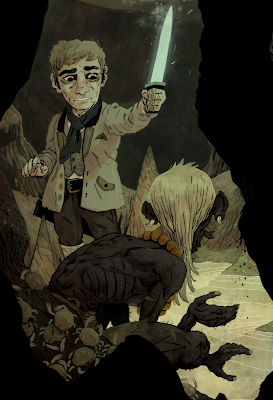
And a larger version of the final image for your perusal.
Thanks for reading and for following this project through its trials and tribulations. This is a difficult process, and I really appreciate the encouragement. I hope these posts are helpful.


