So, part two is complete after a long and rocky road. I made things really difficult for myself with this piece, partly because I wanted it to be great, and partly because I was really stupid about it. Hopefully this long, long post will help you avoid the mistakes that made this so arduous.
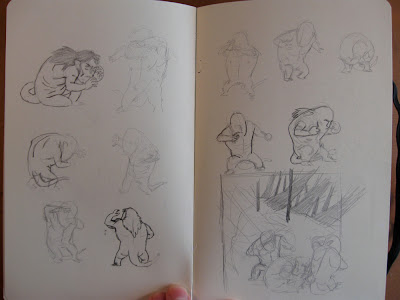
I had a vague idea of what I wanted with this piece, but as always, I am unable to turn that into a decent thumbnail. Some great illustrators (
Kali and
Meg come to mind) have said they get flashes of imagery in their head and that's how they get to their sketches and then finals. I am the sheer opposite of that, and it takes me a lot of time and a lot of drawing to nail down something decent. Here I'm just exploring troll poses.
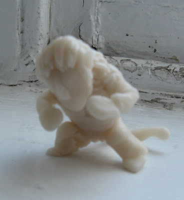
I had a hard time grasping the odd, bulky troll anatomy that I drew out in the concepting stage, so I made a tiny maquette out of polymer clay and moved it around. I did a few gesture drawings off of that to get my hand used to the figure. This was important because I never specified a few thing in the concept stage (how the neck connects, the shape of the back, etc).
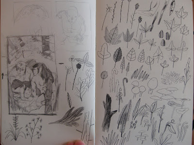
After a lot of thumbnailing, I found something I was pretty pleased with. I'm on a fairly limited timeline with these Hobbit pieces, so I needed to grab onto something quick and then race to the finish. The right page are foliage drawings largely copied from a Charley Harper book. I don't draw a lot of foliage, and so a lot of the shapes are foreign to me. I didn't use a lot of these in the final, but it got my hand and mind used to the concept.
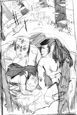
Here is the final thumbnail that I went with. I was pretty confident that it was going to work out, but it didn't and I wouldn't find that out until several days and a lot of work hours later. If there's one lesson to take away from my idiocy it's this:
ONCE YOU FIND A THUMBNAIL YOU LIKE, KEEP THUMBNAILING UNTIL YOU FIND ONE YOU LOVE. 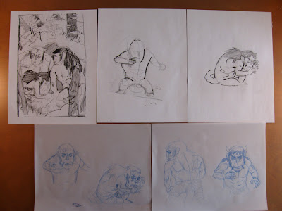
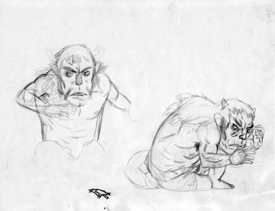
Here is the printed, enlarged thumbnail and the first few drawings I did. I'm working in non-photo blue pencil on drafting vellum in these early stages. I was really careful here to figure out how the trolls' muscles worked before I simplified them too much.
Here are two of those pages. I was a little bummed that my composition didn't give me a chance to show the trolls' tails, because I really liked them.
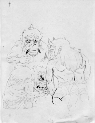
Here are the trolls together for the first time.
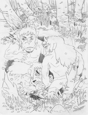
I drew the background fairly spontaneously this first time, just placing different types of foliage helter skelter throughout the image. This isn't really the way I usually work, and it felt wrong.
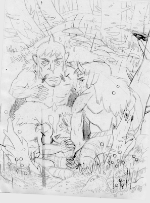
Another version of the previous drawing, with things planned out a bit more. I had a tough time placing the crow, which you'll remember belongs to one of the dwarves in the previous piece. It's not a detail included in the book, but I thought it added some personality.
I moved the bird to the bottom and straightened out the one trolls' arm, since
Brian said it looked like they were doing something tawdry.
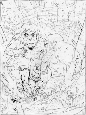
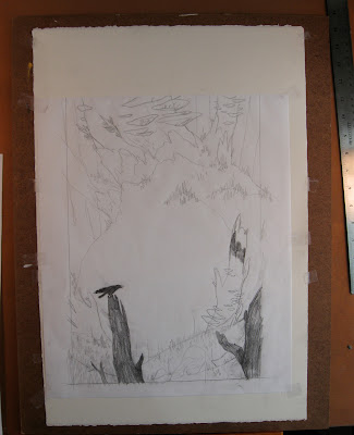
At this point I've blown up and printed the previous drawing to the size I'm going to be working for the final.
I decided to draw the background and the trolls separately so that the digital image would be a little easier to handle.
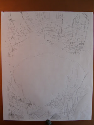
Here is the first drawing of the background, at a final stage. Too complicated!
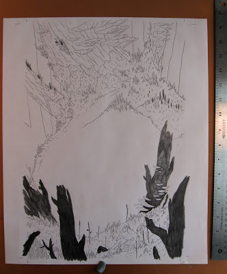
I was much happier with this simplified background, even though I was still making a lot of mistakes. Something that I should have considered was the reason I was working this large. I didn't blow up the sketch so that I could pump a lot of miniscule detail into it, I blew up the sketch so that I could draw larger. This is a mistake I will continue to make through this piece.
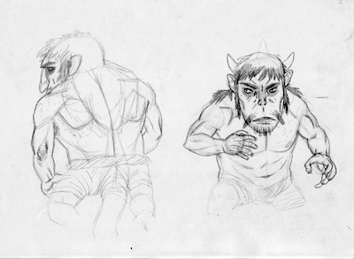
The first troll, which I was pretty happy with. Unfortunately, I forgot that I was going to give them craggy gross elbows, so I had to do it again.
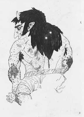
Luckily this drawing was better than the first one. I could have just drawn the elbow and pasted it onto the first drawing in Photoshop, but I think redrawing things is good for you. It almost always shows you different, better avenues.
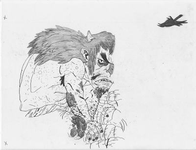
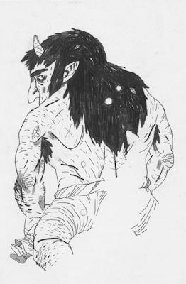
This troll's face is one of my favorite drawings I've ever done.
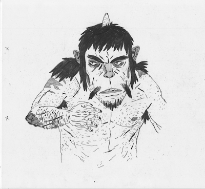
I was very happy with the second and third trolls, and they'll stay the same through the final.
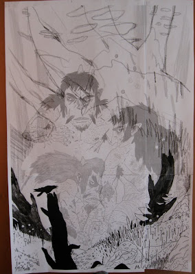
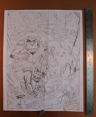
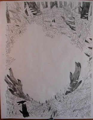
Alright, this is a big change. I had already taken the previous final drawing into the computer and did flats for it. I was basically ready to go, but something was still nagging me. It lacked focus and it lacked gesture. It was too full of compositional tricks that I used to try and hold it together. I drew and pieced this new comp digitally and printed it.
Here I'm working on the new background on rag marker paper, which is semi translucent and extremely tough. I tape it down to a board over a heavy piece of hot press arches watercolor paper. I have a ton of paper scraps left over from other pieces, and I use the watercolor paper as a soft backing for the thin marker paper. This generally lets me get good darks from my pencils and keeps me from breaking lead as often as I would otherwise.
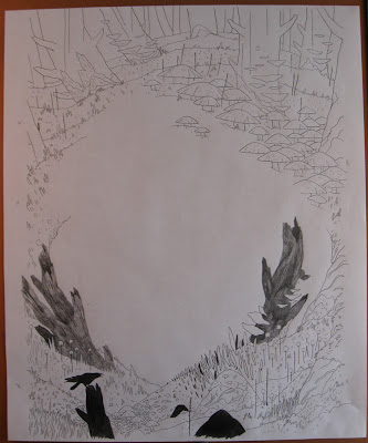
Here is the final background drawing, which I was very happy with.
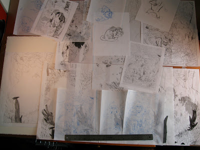
Aaaand here is the desk that I work on, laden with all of the drawings from this piece.
I explained the reason for doing flats in the last process post, and it's the same here. It cuts down on file size and makes managing multiple objects easier.
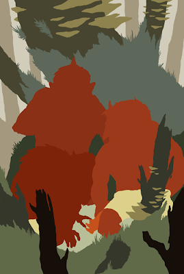
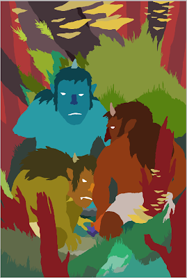
At this point I was really struggling to figure out what colors I wanted to use in the final. I knew it was going to be largely green and gray, but I didn't have a solid idea for what colors the trolls would be. I liked them as red and orange, but Kali pointed out that having them blend in with the background would be more logical and end up looking better.
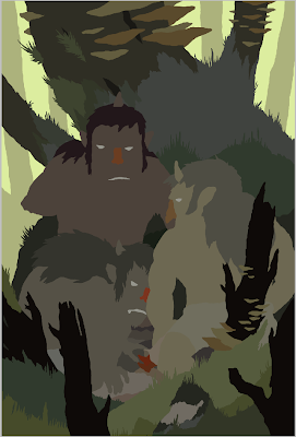
Since this scene takes place just as dawn breaks, the lighting had to be very specific or else the impact would be lessened. I tried these colors with the sky as red, gold, yellow, pink, and finally this yellow-green. Yellow-green isn't the most obvious color for dawn, but I think it gives the forest a little more creepy atmosphere. I try to do as much lighting by just choosing the correct flat colors before I begin to add shadow or highlights to anything.

Because I set up flats for this image, I was able to do the modeling and rendering entirely on one layer without any hassle. Again, I use a lot of custom brushes in Photoshop made from paint and ink and pencil and concentrate mostly on color variation rather than exact realistic rendering.
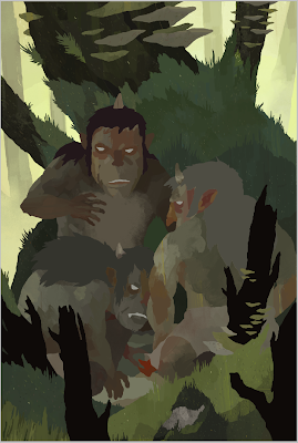
I went around the image and added a layer of multicolored lines on the environment's surface. This added just a little layer of depth and texture which is easy to overlook but helped further the atmosphere.
Like in the previous piece, I added an overall layer of shadow by setting a layer to Multiply and painting in a light purple color. This helps add direction and color to the lighting.
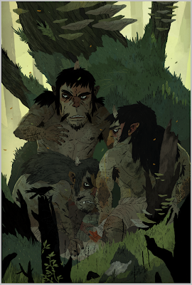
A couple of small color adjustment layers were added, as well as a layer of graphite texture and a layer of ink texture. Just more subtle tweaks. I also added a pencil texture to the bark of the main tree and subtle striping to the trolls.
Here are the lines laid in and colored.
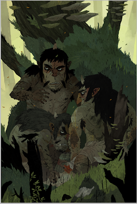
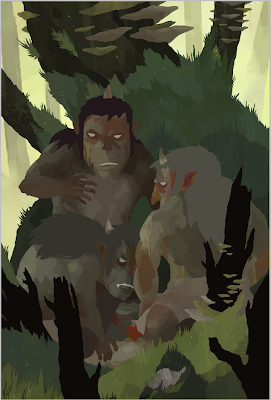
I added the vine in the foreground and some falling leaves. I needed the foreground vine to break up that heavy black space, and the falling leaves add a little bit of warmth to the blueish green foreground elements.
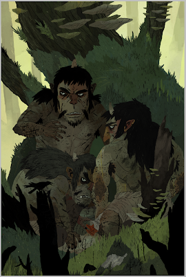
Some final tweaks to the lighting and we're just about done.
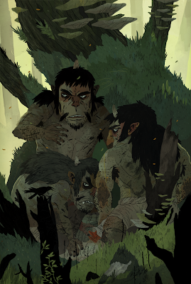
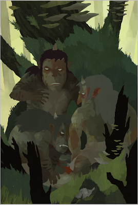
And that's that. Here is a slightly larger version of the final for you folks to investigate.
The final image is approximately 11x16 inches, pencil, ink, and digital.

 Once again, John Sandford at Carus Publishing gave me the opportunity to draw some weird stuff for Muse Magazine. This cover and following spots accompanied an article about the effect names have on our development. Unusual names tend to be more of a burden than a blessing, and people with names closer to the front of the alphabet typically have a natural advantage in the world. It was surely an interesting article.
 Sometimes people with job-specific names pop up. These baseball players are very specialized.
 The attractiveness or ugliness of a name is a factor in personal and professional success.
 People whose initials spell out ominous things often have issues. A weighty name typically leads to trouble.
 Sometimes people with job-specific names pop up. These baseball players are very specialized.
 The attractiveness or ugliness of a name is a factor in personal and professional success.
 People whose initials spell out ominous things often have issues. A weighty name typically leads to trouble.


