Apr 29, 2010

Great Goblin 3

Some silhouette exercises, numbered for your (and my) convenience. I like doing these because they're quick and helpful, letting you make easy decisions about posture and shape without putting in all the little details. I took a class with Brian Ralph in school and he really hammered home the value of silhouette drawing.

I think 3, 6, and 8 are my favorites so far, but let me know your thoughts. Also compare these to regular goblin silhouettes (here).

More soon.

Apr 28, 2010

Great Goblin 2

The facial structure of the Great Goblin is making more sense to me the further I go into the design. I'm pretty confident that I've hit on something I can live with, but there's a certain joy to drawing further once you've happy with a design. You never know what you're going to stumble upon, and even if it leads nowhere, well, you can always backtrack.

I didn't draw any caps or helms on these guys because I want to focus more on their physical shapes. Those things will be added in later in the design process.

I suppose I'll be heading into silhouettes and armament for this guy soon, if not right away. I'm beginning to think a little further down the line to the next design I have to tackle, and that can be a little dangerous. I don't want to get complacent or over eager to move on without giving this guy the attention he deserves.

I've been reading a lot of the articles over on Temple of the Seven Golden Camels, which has been helping me keep my mind in order while I draw. Now that I'm on my own and no longer in school, there's no one to really kick me if my drawings start to get flat or if I start to get lazy in one way or another. The series of posts called "A Kick in the Head" (beginning with this one) has been especially useful. I forgot to draw the little arrows letting you know the order in which I drew those Goblins (top left, middle left, bottom left, top right, etc.), but I think you can tell that I started thinking a little bit more from the third drawing on. When the drawing is sound the design is easier to come by.

Also I am reading Making Comics by Scott McCloud. Take from that what you will.

Apr 26, 2010

Great Goblin 1

Designing the Great Goblin, the chief, king, warlord, of the goblins in The Hobbit has been an interesting thought process for me. In some ways it's just taking elements from the previous goblin design and expanding on them, making things larger and meaner and all that. In other ways, it's developing the concepts of goblin physiology and implementing those upon the original design.

There in the shadows on a large flat stone sat a tremendous goblin with a huge head, and armed goblins were standing round him carrying the axes and the bent swords that they use.
-Over Hill and Under Hill, The Hobbit

That's the extent of the book given to describing the Great Goblin.

I've been thinking of the goblins as having some sort of physical development that kicks in once they hit adulthood. Because they are so warlike and so violent, very few actually reach full maturity and become these larger and more powerful creatures, which would naturally obtain some sort of leadership or even deification within the tribe. These are the Great Goblins, who rule their colonies, lead in their wars, breed with the gross goblin women, and pass on their superior genes. They also have the darkest, reddest caps.

I am still playing around with how I signify these changes in the design, and specifically how I add them onto the base goblin design. I like tusks and horns, since those are developments that exist in natural animals and signify maturity. I'm also expanding on the pig/bat/mole-like nose that the smaller guys have. The second page up there contains a few solid jumping-off points.

In other news, Picturebook Report has gained a new member in Chuck Groenink! Good news for everybody.

I also have to direct you to this post on Kali's blog, which talks about the amazing sketchbooks sent to us by Mel Chao and Mark Grambau of To Boldly Fold. It is truly an amazing piece of work, and for someone whose artistic talent stops at two dimensions, seeing the care and craftsmanship that goes into these books is truly humbling. I will talk more about the book once I start to work in it.

Apr 25, 2010

Goblins 6


I tried out some weirdo bird/turtle Goblins, which were pretty funny. I couldn't picture them singing, though, so that wouldn't work. The final design is the checked face on the last page, though a few of the other ones will work with a few tweaks. This was a strange process. I threw together a lot of animal parts I wanted to use and blended until I couldn't really see them anymore. Add a little raccoon tail and a bandit mask and we're good to go. Moving along, then...

I had some fun drawing more Goblin weapons on that last page. A few of them work and a few of the last batch work. I really like the cleavers with the big teeth and the fatter blades, as well as some of the little daggers.

Great Goblin's up next.

Apr 23, 2010

Goblins 5

Here are some terrible Goblin drawings to make your Friday more hilarious:


I took several steps back to reevaluate the Goblins, and maybe now I'm approaching something even remotely correct. The lower left drawing on the last page is where I'm at now, which is alright. I spent a couple pages up there knocking off King Mignola (who has a lovely new website), which got me somewhere, I think. Maybe not. Hmm. At least their caps are fitting better.

There is also a frustration-cthulhu up there, which is a great thing to draw when things aren't going right and you need to blow off some visual steam.

There's a part of my that wants to give the goblins a weird tapir snout, so we'll see where that goes. So far all of these design explorations have stopped at about 5 installments, but I'm going to be passing that with this one. Man. I still have to do exercises for the Great Goblin before the next piece, also. Pfffff.

Apr 19, 2010

The Hobbit, part three: process

Here I am now, one quarter of the way through this project. Things are coming together pretty nicely, though I'm about to pass the point to which I have concept drawings. Goblins are next on the docket, and I am still designing them, so....things should be getting interesting!

Anyway:


I spent a lot of time thumbnailing this piece. I very consciously spent more time than usual at the thumbnailing stage in an attempt to make things easier on myself this time. It certainly made some things easier, or at least not as stressful when drawing didn't go well. It's easier to settle down after doing a lot of bad thumbnails than after doing a lot of bad full-scale drawings. LESSON LEARNED.

I actually ended up putting the drawing down for awhile at this point, which was great, although it pinched the deadline a little. I was struggling through the thumbnailing process and wasn't getting anywhere, so I needed something to kickstart my brain.
I took some time to really put things together in my head a lot more than I usually do and drew this almost immediately upon returning to work after my short breather. I really like to draw my environment by hand and then place figures in digitally, since I can move and resize them easily. I also don't risk irreparably mucking up the drawing.

Alright, at this point I'm drawing on drafting vellum (more on that later) at 8.5x11" to get things more finalized. Trees are great to draw since you can place branches basically anywhere you need them to shore up your composition. On the other hand, it's also shockingly difficult to draw a convincing tree that doesn't specifically look like you calculated exactly where you needed to place branches. It's a tight balance. I had sycamores on the mind when I drew this, but the trees are described as being either Beech or Oak, so I tried to hit it somewhere in the middle.
Once again, I'm combining my drawing with Photoshop to decide where things need to go. I ended up eliminating the male elf on the left almost entirely, since he threw off the balance. Photoshop also made it really easy to block in where I wanted the leaves to be so I could draw them more spontaneously when it came to the final.
I'm drawing on rag marker paper at full size here, one step before the final drawing. I spent most of the time here further blocking in the leaf clusters and decided what the main elf's face would be like. I have a book of Klimt's drawings on my desk that nine times out of ten I reach to whenever I'm having trouble drawing women.
Here is the final drawing before it's scanned. This was my first time using pencil on duralar, which I mentioned in the previous blog entry. I'll touch on my paper preferences later on in the post. I knew from the beginning that I wanted to add more tone into the drawing and work in less layers than I usually do. It was a little disorganized but ended up giving me a real sense of satisfaction when everything was in its place. I ended up redrawing a bit of the girl's hair digitally, since the movement was off.
My flats on the left and the colors I worked with on the right. I try to keep the flats on my own work pretty wacky colors so I don't subconsciously start to think about my final colors while I'm doing them. It's really to make sure that my selections are clean and simple. This is the first blue sky I've drawn in recent memory.
I've mentioned in previous process posts how I texture my shapes, represented here on the left. This is the main point at which depth and richness get pushed into the colors. The middle image is a new step for me, which I'll incorporate into future pieces. I took scans of a few different pieces of ratty old paper and combined them into one texture. I erased parts of it out where I wanted the texture to be cleaner and then set the layer to Soft Light over my rendered layer. The change is subtle, but it ends up adding a lot of fun little irregularities.
I'm coloring my lines less and less in these illustrations, and leaving a lot of the original black in the finals. I mentioned in the first process post how I isolate my lines to color them, so I won't reiterate that here. The image on the left shows my lines and the one on the right shows how they look over the drawing at this point.
This is another texture layer I applied, made with powdered graphite and a wide brush (and my fingers). I erased about 50% of the texture from the main tree trunk, since I liked how things looked already. The rest of it was colored based on what it sits on and the opacity was turned down to about 25%. This just breaks up some of the obviously "digital-looking" paint strokes and unifies the colors a bit.
Here I've added a layer of light, desaturated purple set to multiply to add some simple shadows.
This is a separate drawing of some leaves that went over everything. I did it separately so it could be colored simply and quickly.

And here is the final image after a few adjustment layers. I also added a small design to the wind chimes.
On paper types:

Here are the four paper types I typically use, laid out to show their different opacities. I also sometimes use vellum bristol, which you already know is totally opaque.

-The copy paper is super cheap and crummy. I use it for sketching outside of my notebook.

-The rag marker paper comes from Borden and Riley and I buy it in pads of 11x14 and 14x17". My local art store doesn't carry it anymore, so I have to buy it online and so use it less than I used to. It's tough and semi-translucent with a medium tooth. It's a bit light and tends to crinkle a little more than I care for, but it's solid and takes pencil very well. It scans fairly well, but I typically add a piece of opaque paper behind it when I put it on the scan bed.

-The drafting vellum (sometimes called design vellum) I buy is the closest paper I could find to the Borden and Riley rag marker paper. It's slightly more translucent and a little less liable to crinkle, though the tooth is slightly different and it doesn't erase quite as well. I buy it in pads of 9x12" and go through it quickly. It's great for comping images together and I sometimes use it for finals.

-Duralar is the newest addition to the bunch for me, and so far I like it a lot. It's tougher and heavier than the other papers and more translucent, though there is almost no tooth to it and it tends to smudge easily (which also means that it erases very easily). I buy it in large sheets and cut it down. It tends to smooth out pencil lines, which I like, and registers faint lines very well. I'd compare its surface to the surface of a Wacom tablet (to the point where I got deja vu while flatting my image). It scans very well.

I can't say how these surfaces react to other media, since I really only draw in pencil outside of my sketchbook.

Apr 15, 2010

The Hobbit, part three

"Now it is a strange thing, but things that are good to have and days that are good to spend are soon told about, and not much to listen to; while things that are uncomfortable, palpitating, and even gruesome, may make a good tale, and take a good bit of telling anyway. They stayed long in that good house, fourteen days at least, and they found it hard to leave. Bilbo would gladly have stopped there for ever and ever --even supposing a wish would have taken him right back to his hobbit-hole without trouble. Yet there is little to tell about their stay."

The Hobbit, chapter three: A Short Rest

Apologies for lateness, but things are done when they are done.

This chapter was both a pleasure to illustrate and a bear to deal with. The chapter centers around one event (the finding of moon letters on Thorin's map) and a whole lot of nothing. It seems like a given to illustrate Elrond holding the map before the moon and discovering those runes telling of the key to the secret passage into the Lonely Mountain. However...there are precious few rests to The Hobbit, and this is one of them, and that in itself is worth visiting.

When it comes to illustrating a passage where the central point is that nothing is happening to our protagonist, a new set of problems arises. How do you make a narrative image with no conflict without it becoming boring or trite or cliched? I guess it's all about activating the senses. I wanted to evoke that sense that Bilbo is feeling, where you wouldn't want to leave this place ever again. I don't know if I'm there, but that was the goal.

An aside: Did you know there are no women in this book? I can't think of even one being mentioned. This scene with the elves was one of the only parts where I could sneak a lady in without much hassle, and I had to take it.

When Bilbo and the dwarves arrive in Rivendell, the elves are singing to them from the trees. Not singing anything important, but just singing to them. I liked the idea of the trees just emanating sound, which is where those wind-chimes come in.

On the technical side:

I decided that I needed to vary my technique up some, since I have been feeling that my regular methods were stagnating a bit. The work was looking fine, but the process left me looking for something else and seeing very little room for improvement aside from the betterment of the drawings themselves. I asked for a bit of help and was pointed in a couple of excellent directions by my friends Chuck and Niv.

Chuck turned me on to a different method of coloring, and while I didn't use it exactly, I did take away one fundamental change: begin with more texture in the original drawing rather than layer it on afterwards. This lead to a more cohesive image overall, since my textures and lines were drawn together rather than separate. Niv suggested drawing on matte duralar, switching over from my regular translucent drafting vellum. This doesn't sound like a big change (one translucent paper to another), but the duralar has a much different tooth and has a natural haze to it which smooths out the pencil lines. It's something I'll be using in the future for sure.

Look out for a process post on this in the next couple of days. I promise it will be shorter than the last one.

In other news, you'll be seeing this guy in Spectrum 17 this fall.

Apr 2, 2010

Dolor #4

A few months ago Michael Meier and the nice folks over at Rotopol Press in Germany (for whom I previously did this piece) asked me to do the cover for their upcoming mini-comic anthology Dolor. Being a fan of what they do and working for nice people, I obviously agreed and produced this thing. For some reason I was really thinking about Hands of Glory and figured now was the time. I wanted to challenge myself to do the title type as well, since text is something I with which I am very unaccomplished. I think it turned out fine.

My original plan was to remove the thumb and have the four fingers signify that this was the fourth volume of Dolor, but then this would've just been the Left 4 Dead cover, wouldn't it?

Here it is with text, which they nailed:

ADDITIONALLY: Thank you for the emails regarding spare postcards. I have addressed one to everyone who messaged me and I'm on the way to the post right now. MICA Illustration students, I still haven't put these in the office, but I'll put something on twitter when they're there. Get off my case.

Mar 31, 2010

What's in a Name?

Once again, John Sandford at Carus Publishing gave me the opportunity to draw some weird stuff for Muse Magazine. This cover and following spots accompanied an article about the effect names have on our development. Unusual names tend to be more of a burden than a blessing, and people with names closer to the front of the alphabet typically have a natural advantage in the world. It was surely an interesting article.

The cover is meant to invite the reader to give these characters their own names based on their physical appearance.

Spots:
Sometimes people with job-specific names pop up. These baseball players are very specialized.
The attractiveness or ugliness of a name is a factor in personal and professional success.
People whose initials spell out ominous things often have issues. A weighty name typically leads to trouble.

Mar 30, 2010

Housekeeping


Here are my new postcards, all ready to be shipped out to art directors across the country. I used Gotprint.com and was delighted. I have a few of these (~10?) left over, and I will send one to you. All you have to do is send an email to sambosma@gmail.com with your address. If you're currently a MICA student, there will be a batch of these in the IL office, so you can grab one there sometime soon.

In other news, I spent some time remodeling my website, please click the portfolio link at the top right and check it out.

Mar 22, 2010

Some faces


I hope to get back to Hobbit work and either daily or at least more frequent posting as soon as possible, but I have been busy with other things. Here are a bunch of faces from a work in progress cover for Muse Magazine which basically amounts to me drawings, well, tons of faces. This a little less than half of the final count. You may recognize some old friends.

In other news, I got something into Spectrum this year, which is their 17th issue. I was in it last year, and I was pleasantly surprised to be included again. Among the accepted artists are some friends of mine like Kali, McLean, Annie, and Sean. I won't find out what piece will be in the book until sometime next month, and the book ought to be out nearer to November.

Mar 11, 2010

The Hobbit, part two: process

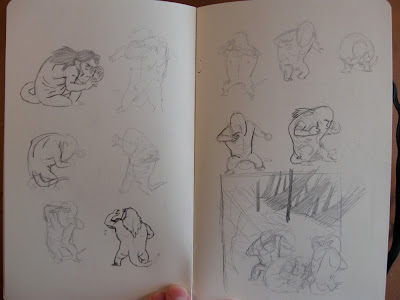
So, part two is complete after a long and rocky road. I made things really difficult for myself with this piece, partly because I wanted it to be great, and partly because I was really stupid about it. Hopefully this long, long post will help you avoid the mistakes that made this so arduous.I had a vague idea of what I wanted with this piece, but as always, I am unable to turn that into a decent thumbnail. Some great illustrators (Kali and Meg come to mind) have said they get flashes of imagery in their head and that's how they get to their sketches and then finals. I am the sheer opposite of that, and it takes me a lot of time and a lot of drawing to nail down something decent. Here I'm just exploring troll poses.
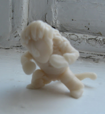
I had a hard time grasping the odd, bulky troll anatomy that I drew out in the concepting stage, so I made a tiny maquette out of polymer clay and moved it around. I did a few gesture drawings off of that to get my hand used to the figure. This was important because I never specified a few thing in the concept stage (how the neck connects, the shape of the back, etc).
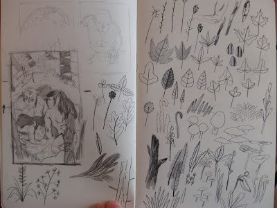
After a lot of thumbnailing, I found something I was pretty pleased with. I'm on a fairly limited timeline with these Hobbit pieces, so I needed to grab onto something quick and then race to the finish. The right page are foliage drawings largely copied from a Charley Harper book. I don't draw a lot of foliage, and so a lot of the shapes are foreign to me. I didn't use a lot of these in the final, but it got my hand and mind used to the concept.
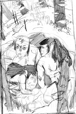
Here is the final thumbnail that I went with. I was pretty confident that it was going to work out, but it didn't and I wouldn't find that out until several days and a lot of work hours later. If there's one lesson to take away from my idiocy it's this: ONCE YOU FIND A THUMBNAIL YOU LIKE, KEEP THUMBNAILING UNTIL YOU FIND ONE YOU LOVE.
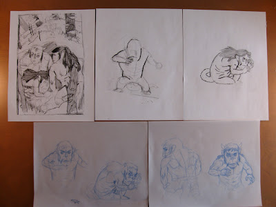
Here is the printed, enlarged thumbnail and the first few drawings I did. I'm working in non-photo blue pencil on drafting vellum in these early stages. I was really careful here to figure out how the trolls' muscles worked before I simplified them too much.
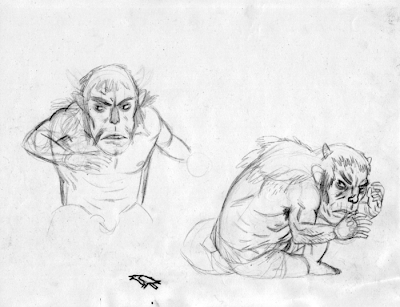
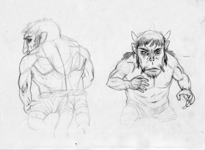
Here are two of those pages. I was a little bummed that my composition didn't give me a chance to show the trolls' tails, because I really liked them.
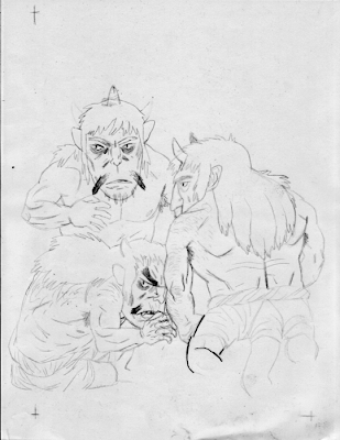
Here are the trolls together for the first time.
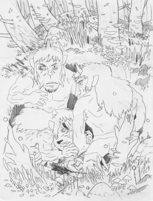
I drew the background fairly spontaneously this first time, just placing different types of foliage helter skelter throughout the image. This isn't really the way I usually work, and it felt wrong.
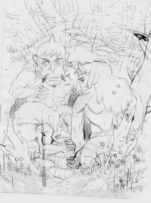
Another version of the previous drawing, with things planned out a bit more. I had a tough time placing the crow, which you'll remember belongs to one of the dwarves in the previous piece. It's not a detail included in the book, but I thought it added some personality.
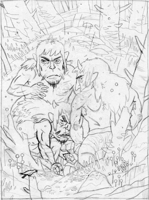
I moved the bird to the bottom and straightened out the one trolls' arm, since Brian said it looked like they were doing something tawdry.
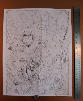
At this point I've blown up and printed the previous drawing to the size I'm going to be working for the final.
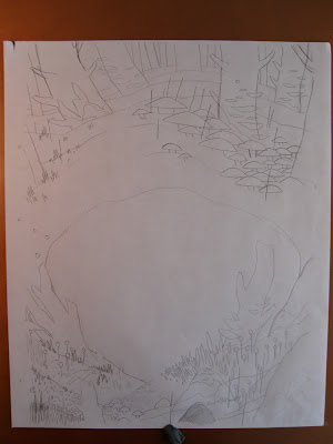
I decided to draw the background and the trolls separately so that the digital image would be a little easier to handle.
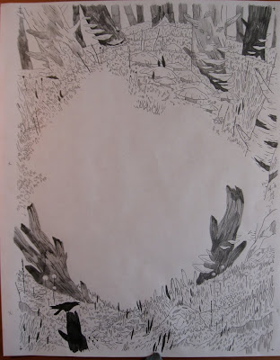
Here is the first drawing of the background, at a final stage. Too complicated!
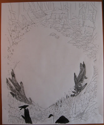
I was much happier with this simplified background, even though I was still making a lot of mistakes. Something that I should have considered was the reason I was working this large. I didn't blow up the sketch so that I could pump a lot of miniscule detail into it, I blew up the sketch so that I could draw larger. This is a mistake I will continue to make through this piece.
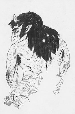
The first troll, which I was pretty happy with. Unfortunately, I forgot that I was going to give them craggy gross elbows, so I had to do it again.
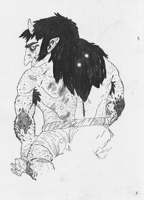
Luckily this drawing was better than the first one. I could have just drawn the elbow and pasted it onto the first drawing in Photoshop, but I think redrawing things is good for you. It almost always shows you different, better avenues.
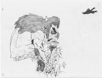
This troll's face is one of my favorite drawings I've ever done.
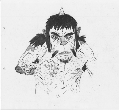
I was very happy with the second and third trolls, and they'll stay the same through the final.
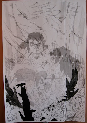
Alright, this is a big change. I had already taken the previous final drawing into the computer and did flats for it. I was basically ready to go, but something was still nagging me. It lacked focus and it lacked gesture. It was too full of compositional tricks that I used to try and hold it together. I drew and pieced this new comp digitally and printed it.
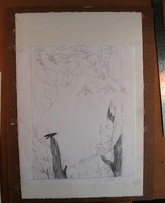
Here I'm working on the new background on rag marker paper, which is semi translucent and extremely tough. I tape it down to a board over a heavy piece of hot press arches watercolor paper. I have a ton of paper scraps left over from other pieces, and I use the watercolor paper as a soft backing for the thin marker paper. This generally lets me get good darks from my pencils and keeps me from breaking lead as often as I would otherwise.
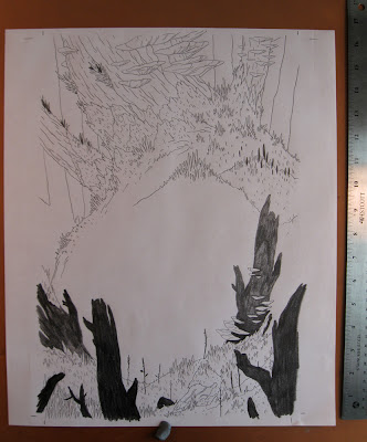
Here is the final background drawing, which I was very happy with.
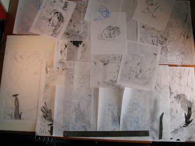
Aaaand here is the desk that I work on, laden with all of the drawings from this piece.
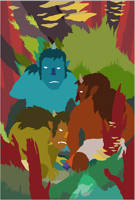
I explained the reason for doing flats in the last process post, and it's the same here. It cuts down on file size and makes managing multiple objects easier.
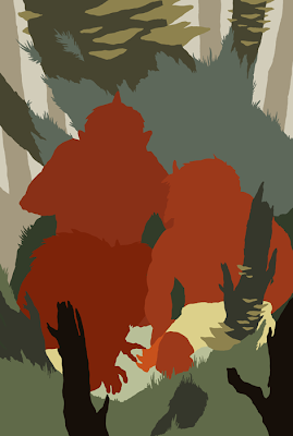
At this point I was really struggling to figure out what colors I wanted to use in the final. I knew it was going to be largely green and gray, but I didn't have a solid idea for what colors the trolls would be. I liked them as red and orange, but Kali pointed out that having them blend in with the background would be more logical and end up looking better.
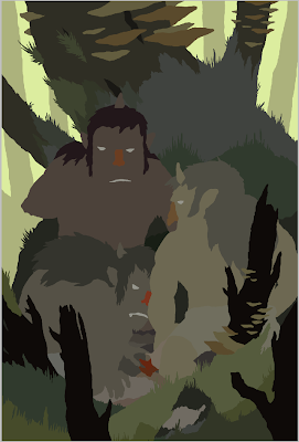
Since this scene takes place just as dawn breaks, the lighting had to be very specific or else the impact would be lessened. I tried these colors with the sky as red, gold, yellow, pink, and finally this yellow-green. Yellow-green isn't the most obvious color for dawn, but I think it gives the forest a little more creepy atmosphere. I try to do as much lighting by just choosing the correct flat colors before I begin to add shadow or highlights to anything.
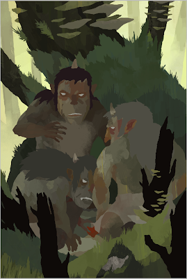
Because I set up flats for this image, I was able to do the modeling and rendering entirely on one layer without any hassle. Again, I use a lot of custom brushes in Photoshop made from paint and ink and pencil and concentrate mostly on color variation rather than exact realistic rendering.
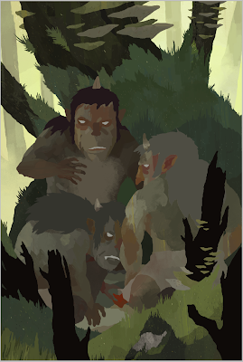
I went around the image and added a layer of multicolored lines on the environment's surface. This added just a little layer of depth and texture which is easy to overlook but helped further the atmosphere.
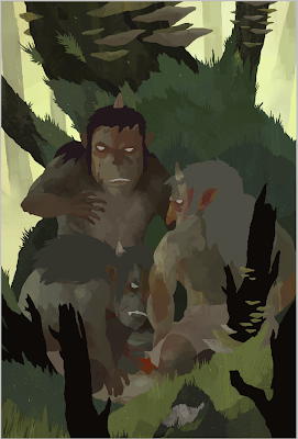
Like in the previous piece, I added an overall layer of shadow by setting a layer to Multiply and painting in a light purple color. This helps add direction and color to the lighting.
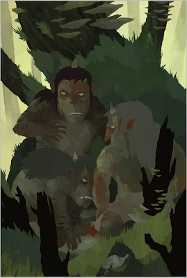
A couple of small color adjustment layers were added, as well as a layer of graphite texture and a layer of ink texture. Just more subtle tweaks. I also added a pencil texture to the bark of the main tree and subtle striping to the trolls.
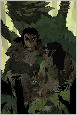
Here are the lines laid in and colored.
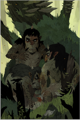
I added the vine in the foreground and some falling leaves. I needed the foreground vine to break up that heavy black space, and the falling leaves add a little bit of warmth to the blueish green foreground elements.
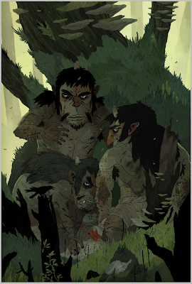
Some final tweaks to the lighting and we're just about done.
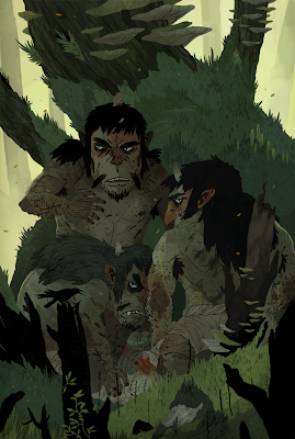
And that's that. Here is a slightly larger version of the final for you folks to investigate.

The final image is approximately 11x16 inches, pencil, ink, and digital.