
Obviously, though, everything starts with thumbnails:


 At this point I was freaking out a little bit. This was what I had accomplished through Friday, with the piece to be delivered the next Wednesday. I knew the approximate scene that I wanted to illustrate but not the proper moment, vantage point, or action. Kali was away in Chicago so I didn't have her around to help me out (like she always does). Things weren't working in the drawing or the composition, and before a sketch or thumbnail can click, you need to get at least one thing right. When you're working alone and the only eyes on a drawing are your own, it's easy to get discouraged.


 At this point I was freaking out a little bit. This was what I had accomplished through Friday, with the piece to be delivered the next Wednesday. I knew the approximate scene that I wanted to illustrate but not the proper moment, vantage point, or action. Kali was away in Chicago so I didn't have her around to help me out (like she always does). Things weren't working in the drawing or the composition, and before a sketch or thumbnail can click, you need to get at least one thing right. When you're working alone and the only eyes on a drawing are your own, it's easy to get discouraged.
I took some time off. I watched Moon, took a nap, got some coffee, and thought about what I wanted. I'm usually an advocate of letting your hand work a sketch out rather than your mind, but when one tool's not working you need to turn to the other. I knew that I wanted the dwarves chained at the bottom of the piece, and that led to placing the viewer amongst them. Once you have one thing working, it's easier to place the rest of the pieces where they need to go. After a few more bad drawings, I hit on something I liked:
 I took Gandalf's figure out of the piece entirely, since Bilbo and the dwarves see the sword before they see the wizard. The piece immediately became stronger with the focus narrowed on the dying figure.
 I took Gandalf's figure out of the piece entirely, since Bilbo and the dwarves see the sword before they see the wizard. The piece immediately became stronger with the focus narrowed on the dying figure.
Up to this point I was drawing using a few different col-erase pencils, which I had never used before (and you can't tell because these images are in Grayscale). They're really nice to sketch with, since you have a larger range of values and you can really work a single sketch out without obscuring too much. They're also about 50% cheaper than the basic pencils at my local art supply store.
After I solidified a couple of things in the composition, I took the thumbnail into the computer and started moving things around digitally. I'm not 100% comfortable drawing digitally, but it's great in the early sketch phase because you have so much control over everything and can move and resize and play with value effortlessly. These were the thumbnails that I built up, and the numbered ones are those that I sent to Kali for her input.
 At this point I was dealing with a slightly different part of the story than I ended up with. Immediately before the Great Goblin is killed, the bonfire is snuffed out and begins spewing blue smoke which shoots sparks into the goblin hoard and kills a lot of them. This is a super cool image and it would have been great to draw all of the goblins in their death throes, but it would have required a lot more work to maintain the clarity of the scene and time was very against me. I changed it a bit and focused the lens even more narrowly on the Great Goblin's death.
I printed this thumbnail at 8.5x11" and redrew things a bit before rescanning and drawing further.
 I worked out the Great Goblin's position and the dwarves a bit further and printed it at my working size, which was around 12.5x17.25". I spent some time sketching out the goblin hoard on a few sheets of paper before drawing it all together in a more comprehensive final sketch in light blue pencil on rag marker paper.
 Here are my underdrawing and the final drawing, which was done on matte duralar. I really liked how my final drawing looked when layered over the sketch, and I figured I could work it into the final somehow. I remembered this post on Adam Rex's blog about using an original sketch as something of a texture layer under black lines. Adam did it 100x better than me, but it's something I'll be looking into further. This is how the two drawings look scanned:
 Having the underdrawing in the final piece roughened things up a little and, I think, helped maintain some of the original charm. I think I ended up setting the layer to Multiply and lowering the opacity a bit. The little "x" marks are in places I intended to fill with solid black. I didn't draw that in since most of my coloring is done with the line layer turned off and it helps me to see where the blacks are going to go while I'm doing that.
 Here are my two layers of flats. The first is a simplified layer which I use to block in colors and the second is the one I use to make selections. When I'm trying to figure my colors out, I don't necessarily need the same amount of detail in the flats as when I'm making selections. The simplified flats are easier to deal with when I'm just looking for the general, overall color.
 The blue smoke and lack of additional light sources in the scene lent itself to a pretty specific color scheme.
 I liked a lot of these alternate color schemes, but none of them were exactly right. Luckily, by this time Kali had returned and could help me out a lot. I usually shy away from cool colors, but it was called for on this piece.
 Here are the final colors I went with before going into the rendering and texturing stages. I rendering things out in the same way as usual, but with a few different Multiply layers to add more shadows and depth to the smoke and main figure. I compiled a few of those steps into one image below:
 And a few details of the rendering with the lines removed:


 The little vertical lines are from a brush that I made from a pencil texture I've used in the past. I really like to turn textures into brushes so I can really layer them on without using a ton of new layers and inflating the file size. I was a little leaner with my texturing and rendering on this piece compared to the last several since I knew I wanted to keep a lot of my black lines and figured that too much texturing and rendering in addition to the black lines would look too messy. In general I am trying to draw more and focus less on digital tricks, and finding that balance is a really interesting challenge.
 I liked a lot of these alternate color schemes, but none of them were exactly right. Luckily, by this time Kali had returned and could help me out a lot. I usually shy away from cool colors, but it was called for on this piece.
 Here are the final colors I went with before going into the rendering and texturing stages. I rendering things out in the same way as usual, but with a few different Multiply layers to add more shadows and depth to the smoke and main figure. I compiled a few of those steps into one image below:
 And a few details of the rendering with the lines removed:
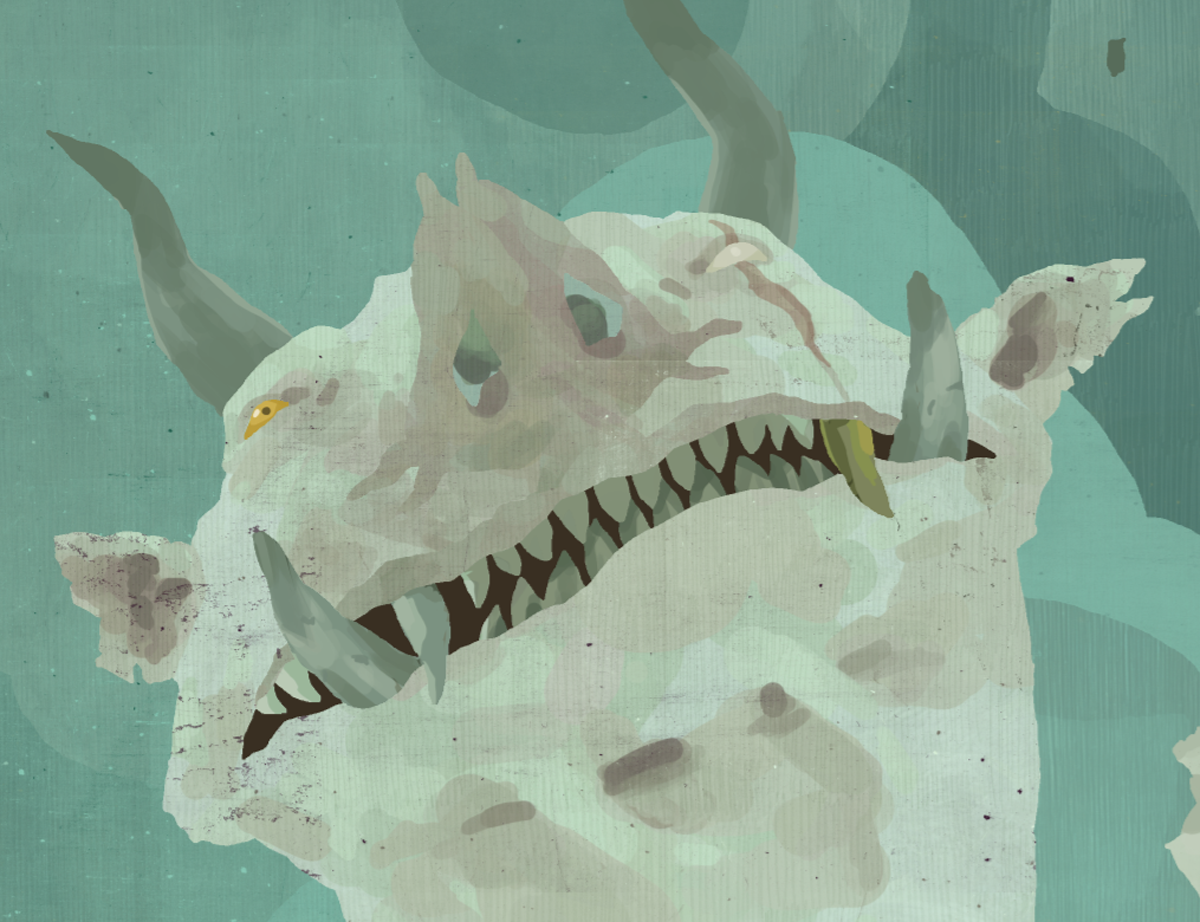

 The little vertical lines are from a brush that I made from a pencil texture I've used in the past. I really like to turn textures into brushes so I can really layer them on without using a ton of new layers and inflating the file size. I was a little leaner with my texturing and rendering on this piece compared to the last several since I knew I wanted to keep a lot of my black lines and figured that too much texturing and rendering in addition to the black lines would look too messy. In general I am trying to draw more and focus less on digital tricks, and finding that balance is a really interesting challenge.
Here is the final piece in a little higher res for your examination:


So well planned and executed! Really one of my fav pieces, and its always great reading your process!
ReplyDeleteoutstanding work as always! i love the process shots!
ReplyDeletegreat process as always Sam!
ReplyDeleteHi there,
ReplyDeleteI was wondering if you could address how you make a texture into a brush, or if you could point me to an earlier post where you already talked about it?
Thank you for sharing so much of your process with us, it has been immensely helpful and inspiring.
-m
Thanks guys!
ReplyDeleteDrawsmall - It's just like turning anything into a brush. Have your image in grayscale at a maximum of 2500 pixels on the longest side, then go to Edit --> Define Brush Preset, and all the black/gray will become a brush. You can edit the brush settings in the Brushes dialog. Here's a more detailed post from Bittbox on making brushes: http://tinyurl.com/yjnoe9w
I agree with everyone. Another great piece to the set. It's great that you share this process with us-we love you.
ReplyDeleteThanks a whole bunch!
ReplyDeleteYou complete me. LOL
ReplyDeleteWonderful, wonderful, wonderful work!
ReplyDeletethanks for this, it's really great to see your process!
ReplyDeletesam, du~~~de! of all your hobbit images, this one is my favorite. thanks so much for always posting your process for your illustrations. i've just recently started down the illustration path and its seriously eye opening reading your blog. you inspired me to do my own "picture book report"
ReplyDeleteFantastic, again. Thanks for the step-by-step. It's fascinating to see.
ReplyDeleteDude, I'm trying to learn how to work digitally, because my 30+ hours of painting always go to waste when I try to scan it and it always scans like garbage. Your blog posts have been SUPER helpful, ALSO you are amazing.
ReplyDeletethe end.