 Another small drawing for The Stranger, advertising the Sasquatch Music Festival. This is the first time I have ever drawn a sasquatch (no Yetis either). I am surprised I rode out that fad a couple years back.
AD Aaron Huffman.
 Another small drawing for The Stranger, advertising the Sasquatch Music Festival. This is the first time I have ever drawn a sasquatch (no Yetis either). I am surprised I rode out that fad a couple years back.
 Time for some non-Hobbit updates, folks.
 Gollum's getting weirder. Some of these are good, some of these are bad. I'll let you tell me what's what.


 At this point I was freaking out a little bit. This was what I had accomplished through Friday, with the piece to be delivered the next Wednesday. I knew the approximate scene that I wanted to illustrate but not the proper moment, vantage point, or action. Kali was away in Chicago so I didn't have her around to help me out (like she always does). Things weren't working in the drawing or the composition, and before a sketch or thumbnail can click, you need to get at least one thing right. When you're working alone and the only eyes on a drawing are your own, it's easy to get discouraged.
 I took Gandalf's figure out of the piece entirely, since Bilbo and the dwarves see the sword before they see the wizard. The piece immediately became stronger with the focus narrowed on the dying figure.
 At this point I was dealing with a slightly different part of the story than I ended up with. Immediately before the Great Goblin is killed, the bonfire is snuffed out and begins spewing blue smoke which shoots sparks into the goblin hoard and kills a lot of them. This is a super cool image and it would have been great to draw all of the goblins in their death throes, but it would have required a lot more work to maintain the clarity of the scene and time was very against me. I changed it a bit and focused the lens even more narrowly on the Great Goblin's death.
 I worked out the Great Goblin's position and the dwarves a bit further and printed it at my working size, which was around 12.5x17.25". I spent some time sketching out the goblin hoard on a few sheets of paper before drawing it all together in a more comprehensive final sketch in light blue pencil on rag marker paper.
 Here are my underdrawing and the final drawing, which was done on matte duralar. I really liked how my final drawing looked when layered over the sketch, and I figured I could work it into the final somehow. I remembered this post on Adam Rex's blog about using an original sketch as something of a texture layer under black lines. Adam did it 100x better than me, but it's something I'll be looking into further. This is how the two drawings look scanned:
 Having the underdrawing in the final piece roughened things up a little and, I think, helped maintain some of the original charm. I think I ended up setting the layer to Multiply and lowering the opacity a bit. The little "x" marks are in places I intended to fill with solid black. I didn't draw that in since most of my coloring is done with the line layer turned off and it helps me to see where the blacks are going to go while I'm doing that.
 Here are my two layers of flats. The first is a simplified layer which I use to block in colors and the second is the one I use to make selections. When I'm trying to figure my colors out, I don't necessarily need the same amount of detail in the flats as when I'm making selections. The simplified flats are easier to deal with when I'm just looking for the general, overall color.
  I liked a lot of these alternate color schemes, but none of them were exactly right. Luckily, by this time Kali had returned and could help me out a lot. I usually shy away from cool colors, but it was called for on this piece.
 Here are the final colors I went with before going into the rendering and texturing stages. I rendering things out in the same way as usual, but with a few different Multiply layers to add more shadows and depth to the smoke and main figure. I compiled a few of those steps into one image below:
 And a few details of the rendering with the lines removed: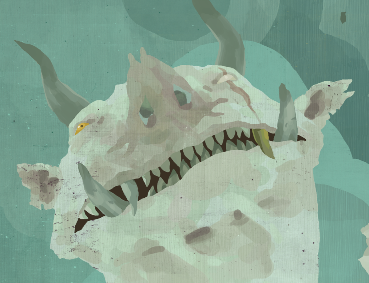

 The little vertical lines are from a brush that I made from a pencil texture I've used in the past. I really like to turn textures into brushes so I can really layer them on without using a ton of new layers and inflating the file size. I was a little leaner with my texturing and rendering on this piece compared to the last several since I knew I wanted to keep a lot of my black lines and figured that too much texturing and rendering in addition to the black lines would look too messy. In general I am trying to draw more and focus less on digital tricks, and finding that balance is a really interesting challenge.


 Those silhouettes up there are just warmups to get my hand moving properly, not serious ones. That secret stuff block isn't actually for an exciting new project, but it's from some freelance stuff I can't show yet, so there we are.
 A small ink drawing I did for Steven at Hey Oscar Wilde! It's Clobberin' Time!, a wonderful blog devoted to drawings of literary figures, both character and authorial.
  I couldn't resist doing some more silhouettes for the Great Goblin here. More of these are working, I think, specifically 12, 14, 15, 17, and 18. I've got some stuff in mind for clothing and armament, so I should have some of that stuff up before too long. I'm still not quite sure whether I like the larger, more impressive horns or the smaller ones. They both say different things about the character.
 Some silhouette exercises, numbered for your (and my) convenience. I like doing these because they're quick and helpful, letting you make easy decisions about posture and shape without putting in all the little details. I took a class with Brian Ralph in school and he really hammered home the value of silhouette drawing.
  The facial structure of the Great Goblin is making more sense to me the further I go into the design. I'm pretty confident that I've hit on something I can live with, but there's a certain joy to drawing further once you've happy with a design. You never know what you're going to stumble upon, and even if it leads nowhere, well, you can always backtrack.
 Designing the Great Goblin, the chief, king, warlord, of the goblins in The Hobbit has been an interesting thought process for me. In some ways it's just taking elements from the previous goblin design and expanding on them, making things larger and meaner and all that. In other ways, it's developing the concepts of goblin physiology and implementing those upon the original design.
 I tried out some weirdo bird/turtle Goblins, which were pretty funny. I couldn't picture them singing, though, so that wouldn't work. The final design is the checked face on the last page, though a few of the other ones will work with a few tweaks. This was a strange process. I threw together a lot of animal parts I wanted to use and blended until I couldn't really see them anymore. Add a little raccoon tail and a bandit mask and we're good to go. Moving along, then...


 I took several steps back to reevaluate the Goblins, and maybe now I'm approaching something even remotely correct. The lower left drawing on the last page is where I'm at now, which is alright. I spent a couple pages up there knocking off King Mignola (who has a lovely new website), which got me somewhere, I think. Maybe not. Hmm. At least their caps are fitting better.


 I took some time to really put things together in my head a lot more than I usually do and drew this almost immediately upon returning to work after my short breather. I really like to draw my environment by hand and then place figures in digitally, since I can move and resize them easily. I also don't risk irreparably mucking up the drawing.
 Alright, at this point I'm drawing on drafting vellum (more on that later) at 8.5x11" to get things more finalized. Trees are great to draw since you can place branches basically anywhere you need them to shore up your composition. On the other hand, it's also shockingly difficult to draw a convincing tree that doesn't specifically look like you calculated exactly where you needed to place branches. It's a tight balance. I had sycamores on the mind when I drew this, but the trees are described as being either Beech or Oak, so I tried to hit it somewhere in the middle.
 Once again, I'm combining my drawing with Photoshop to decide where things need to go. I ended up eliminating the male elf on the left almost entirely, since he threw off the balance. Photoshop also made it really easy to block in where I wanted the leaves to be so I could draw them more spontaneously when it came to the final.
 I'm drawing on rag marker paper at full size here, one step before the final drawing. I spent most of the time here further blocking in the leaf clusters and decided what the main elf's face would be like. I have a book of Klimt's drawings on my desk that nine times out of ten I reach to whenever I'm having trouble drawing women.
 Here is the final drawing before it's scanned. This was my first time using pencil on duralar, which I mentioned in the previous blog entry. I'll touch on my paper preferences later on in the post. I knew from the beginning that I wanted to add more tone into the drawing and work in less layers than I usually do. It was a little disorganized but ended up giving me a real sense of satisfaction when everything was in its place. I ended up redrawing a bit of the girl's hair digitally, since the movement was off.
 My flats on the left and the colors I worked with on the right. I try to keep the flats on my own work pretty wacky colors so I don't subconsciously start to think about my final colors while I'm doing them. It's really to make sure that my selections are clean and simple. This is the first blue sky I've drawn in recent memory.
 I've mentioned in previous process posts how I texture my shapes, represented here on the left. This is the main point at which depth and richness get pushed into the colors. The middle image is a new step for me, which I'll incorporate into future pieces. I took scans of a few different pieces of ratty old paper and combined them into one texture. I erased parts of it out where I wanted the texture to be cleaner and then set the layer to Soft Light over my rendered layer. The change is subtle, but it ends up adding a lot of fun little irregularities.
 I'm coloring my lines less and less in these illustrations, and leaving a lot of the original black in the finals. I mentioned in the first process post how I isolate my lines to color them, so I won't reiterate that here. The image on the left shows my lines and the one on the right shows how they look over the drawing at this point.
 This is another texture layer I applied, made with powdered graphite and a wide brush (and my fingers). I erased about 50% of the texture from the main tree trunk, since I liked how things looked already. The rest of it was colored based on what it sits on and the opacity was turned down to about 25%. This just breaks up some of the obviously "digital-looking" paint strokes and unifies the colors a bit.
 Here I've added a layer of light, desaturated purple set to multiply to add some simple shadows.


