 I haven't had a ton of time to draw the past few days, but here are some variations of that last guy.
 You know, I've already written quite a bit about them, but the simple fact is that Goblins are just little shits.
 I haven't had a ton of time to draw the past few days, but here are some variations of that last guy.

 Things started out pretty rocky when I was drawing last night. I think in my rush to solidify my bat/salamander/lizard/rat design, I lost track of what I liked about the Goblins and lost a lot of the charm. The Hobbit is a kids book, more or less, and so it's important that even the villains have enough charm about them to intrigue the reader even if they're a little scary. These Goblins sing, mind you. Two songs. Two different songs on two different occasions. The Goblins have four scenes in the book, and in two of those scenes they are singing. If you met a Goblin in The Hobbit, there would be a 50-50 shot it would sing you a song, is what I'm saying.
 I've been really excited to start working on the Goblin designs, although I've never had more than a vague smattering of concepts for them. I was never really thrilled with the Peter Jackson representation of the orcs (which I guess are goblins), even though it's pretty true to the source material. I thought it was sort of unimaginative, although it definitely worked in the context.

 Here is that same fleshed out drawing printed out on six sheets of standard A4 printer paper. I lined them up and then set about lightboxing the final drawing over this. I don't always use a lightbox --sometimes I draw the finals on semi-transparant rag marker paper, but for whatever reason I wanted to work on bristol this time.
 Here is a tonal drawing I did on rag marker paper over the final line drawing. I was going to apply this and color it in Photoshop as my texture. However, I ended up scrapping that whole drawing a couple of hours into the digital phase. Sometimes something about a drawing will really bother me or I just won't be satisfied with something. If I catch this before I do the final drawing, all the better. This time, though, I spend a couple of hours debating whether I had the time and inclination to start over. I figured I didn't want to spend the rest of my time looking at it, so I went back to square two.
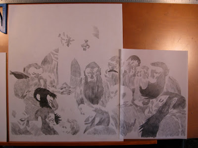
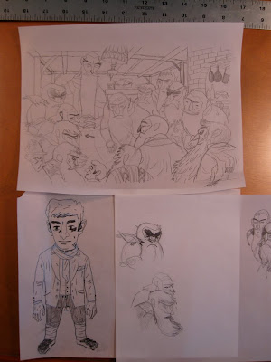 I kept the original thumbnail and drew over it anew, moving a couple of things around and changing a few of the dwarves entirely. I think about a third of the dwarves are directly out of my character sketches from a couple of months ago, but the rest are all new or combinations or whatever. This drawing ended up being much better, and as soon as I decided that I was proud of every part of it, I started working on the finals.
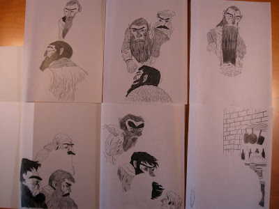 I had a rough time scanning the first drawing at such a size, so I decided to make thing a little easier on myself and do the drawing in sections on A4 drafting vellum. I separated the figures and background in such a way that I could more easily color their linework digitally. I abandoned the ebony pencil and the ink, as they both tend to stiffen up my drawing, and switched over to a plain HB mechanical pencil. I figured the lines didn't need to be super clean and I could deal with the levels in Photoshop.
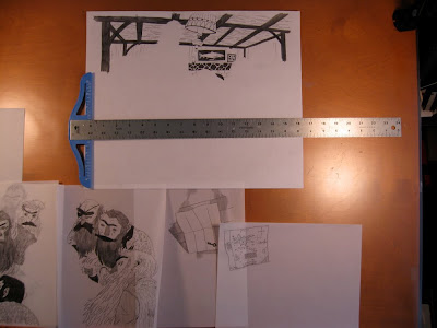 You'll notice that I applied the tone right into the final pencils here without making another drawing layer like I did in the previous attempt. I didn't know how this was going to work out when I colored things, but I had to try something new.
 Here is how the final linework looked when I stitched everything together. Much much better than before.
 I typically don't do flats for my own work, since I do them professionally and I don't like my personal work to feel like my on-the-clock work. Here, though, I felt that flats would make the burden of all fifteen characters a little lighter on me and it definitely did. For those who don't know, "flats" are blocks of contrasting flat color laid in with the pencil tool in Photoshop that you can consistently select and refer to in the coloring process. They are all on one layer, and when I want to render or change the color of an object, I magic-wand select its corresponding flat and work freely on a higher layer. This also helps keep file sizes manageable since it cuts down on the number of layers you need to be juggling.
 I didn't really know what colors I wanted on the piece, just the vague color scheme I had in mind for the dwarves, so I laid in some approximation of that in here.
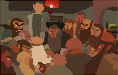 Things really changed and came together when I began considering the lighting in the flat colors. I was really determined to get the lighting acceptable before I started rendering things. The main issue here early one was to balance the colors enough so that the background receded, the foreground popped, and the room was readable despite being dimly lit. Attention had to be paid to Gandalf, Thorin, and Bilbo, who are the main characters in the image. I made sure early on that everything led to Bilbo, since he is absolutely the center of attention.
 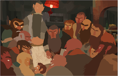 Here I've laid in the texture and rendering for the background. This mostly involves putting down a lot of wild colors and then covering up a lot of that color with what I've determined is the "right" color for the object. This sounds sort of weird, but it ends up creating a lot of nice variation and texture, which is important for me since I don't do too much actual rendering.
 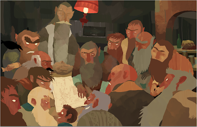 The same principles as the background are applied to the characters. I use a lot of custom Photoshop brushes made from ink washes, watercolor, paint, etc. Bittbox is a great resource if you're looking for stuff like that.
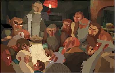 To further the lighting, I added a simple shadow to everyone by setting a layer on multiply and painting with a light purple color.
  This was in the bottom right corner the whole time I worked. I have a tendency to work dark and then frantically fix things at the end, but having the pure white, 50% gray and pure black were great to keep me in check.
 Here I have the lines applied and colored. After I scanned the images, I separated the lines out from the white in the standard way: image in grayscale, channels --> load channel as selection --> select inverse --> copy --> paste into new layer.
 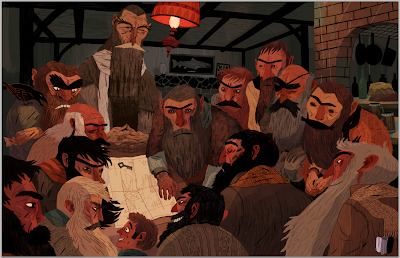 I added a few adjustment layers to bring the foreground out more and emphasize the lighting. A rust colored mask over the figures set to Overlay and a medium-red inkwash texture.


